When Apple unveiled its most recent update for macOS, many people immediately thought of a renaissance of the Aqua UI from the early 2000s. Aqua was Apple’s glossy, colorful, and highly skeuomorphic design language, famous for its candy-like buttons, blue gradients, and translucent effects. With Tahoe, Apple seems to be bringing back that sense of visual depth, but in a modern, glass-based interpretation.
From Apple Newsroom website.
New features of Tahoe
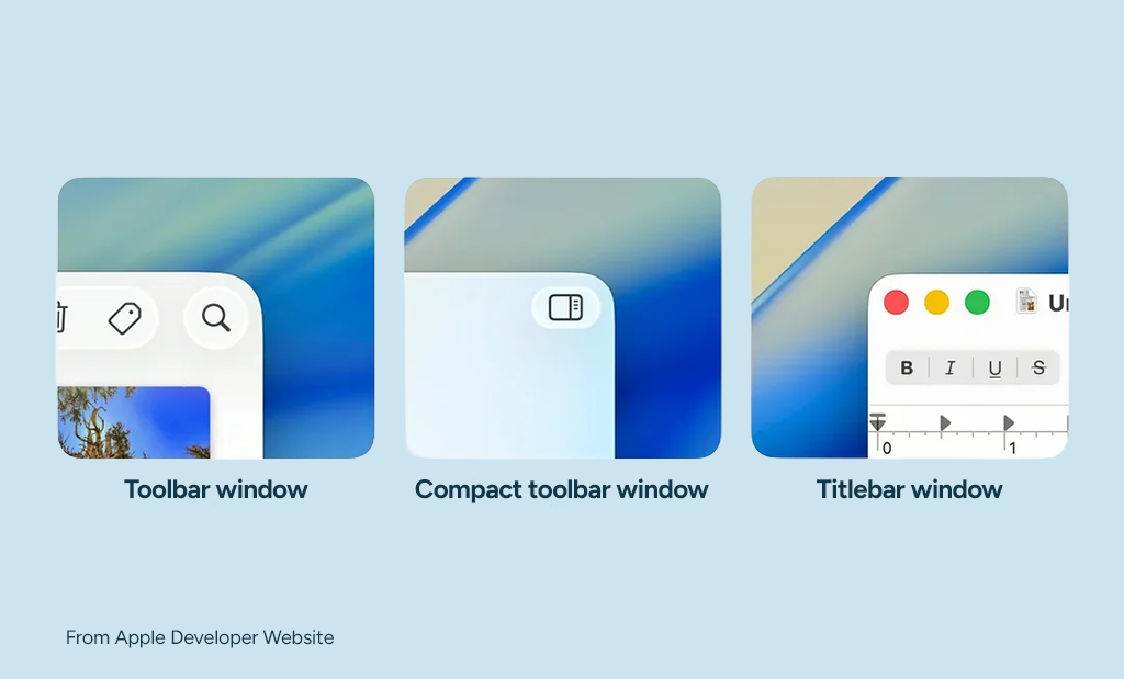
The first thing you notice is the Liquid Glass design. Windows now have subtle reflections, menus float with a transparent glow, and icons were redrawn to match. It really feels like a revival of Aqua’s spirit.
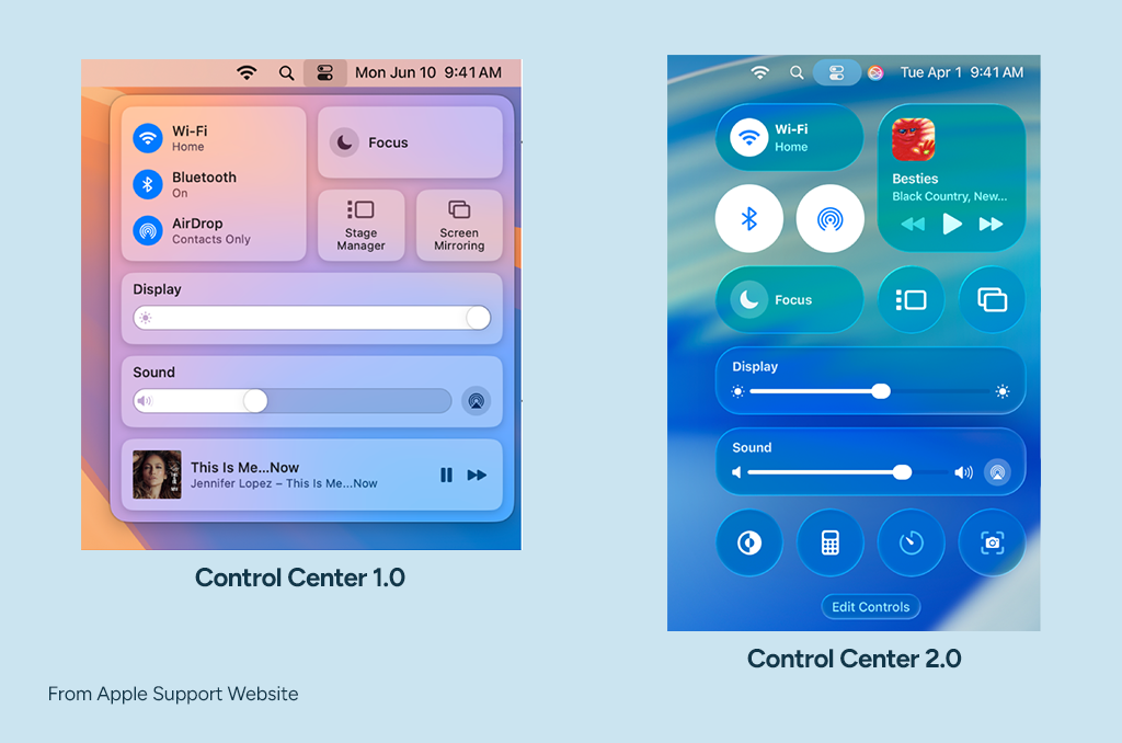
Control Center 2.0 deserves a mention too. It’s now fully customizable: you can add timers, window tiling, or even shortcuts from third-party apps. This feels closer to iOS, and that is welcome.
Personalization also got a boost. You can tint icons automatically, set playful typefaces for the lock screen, or even swap folder icons with emojis. Some of these touches are cosmetic fluff, but they give the OS a bit more character: personalization, something that Windows 11 lacks.
There’s now a native Phone app on macOS. It brings call screening, voicemail summaries, and even Contact Posters. Apple clearly wants to erase the line between Mac and iPhone here.
Then there’s Apple Intelligence: I tested the writing tools briefly, and while they won’t replace a real editor, they’re handy for quick drafts and corrections.
For the more playful side, there’s Genmoji and the new Image Playground. You can create emojis on the fly or generate AI images with a few prompts. Fun for a demo, though maybe less for actual work.
The Positive
One thing I noticed is the fresh set of system icons. They finally look more consistent across apps, with fewer odd styles clashing together. It’s a step towards a more unified system look. Good to have, though not something that makes me particularly excited.
The context menu changes also surprised me. Copy and Paste now show up with their own icons, which feels new to me. It’s a small touch, almost like when you suddenly notice a new cursor design. Tiny details, but they make the OS feel more alive.
The Negative
The new System Settings app still hasn’t won me over. Compared to the old Preferences panel, it feels bloated and less intuitive.
Then there are the rounded corners. Sometimes they look playful, but often they feel exaggerated. Personally, I think Apple could dial this back a bit.
The glass-like transparency is flashy, but at times it reduces readability. With a busy wallpaper, text can get lost in the background. On top of that, Liquid Glass is not only a visual gimmick but also a demanding one, stressing the CPU and GPU with its constant blurs and reflections. This can mean extra heat, faster battery drain, and sluggishness on older Macs.
And finally, the always visible Dock and widgets on startup. When I first booted Tahoe, every widget was on display with glossy effects. Who really wants that? It just adds clutter to the desktop. For me, that’s a solid “no, thanks.”
Conclusion
Is this new “Glass” look just a passing fade, or will it endure over time? That remains to be seen.
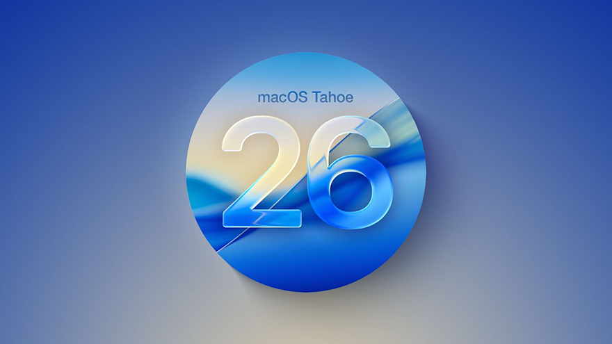
That same sense of reinvention is reflected in the versioning jump: macOS leaps from 15 (Sequoia) straight to 26, and iOS does the same. At first it looks like marketing math, a neat way to align release years. But it could also be Apple hinting at a deeper strategy: a gradual unification of its platforms into a single, multipurpose operating system. Developer Maxi Firtman (@firt) pointed this out, and I tend to agree. I wouldn’t be surprised if that’s the case.
Useful links
- Apple Newsroom – Introducing a delightful and elegant new software design
Official announcement from Apple showcasing the new design language introduced with macOS Tahoe and iOS 26. - Apple Support – Control Center on your Mac
A practical guide on how to set up and customize the new Control Center 2.0 in macOS. - Apple Developer – WWDC 2025: Meet Liquid Glass
A WWDC session where Apple’s design team explains the principles behind Liquid Glass and its integration across platforms.


