DesignTechnologyUX
My impressions on macOS 26 Tahoe
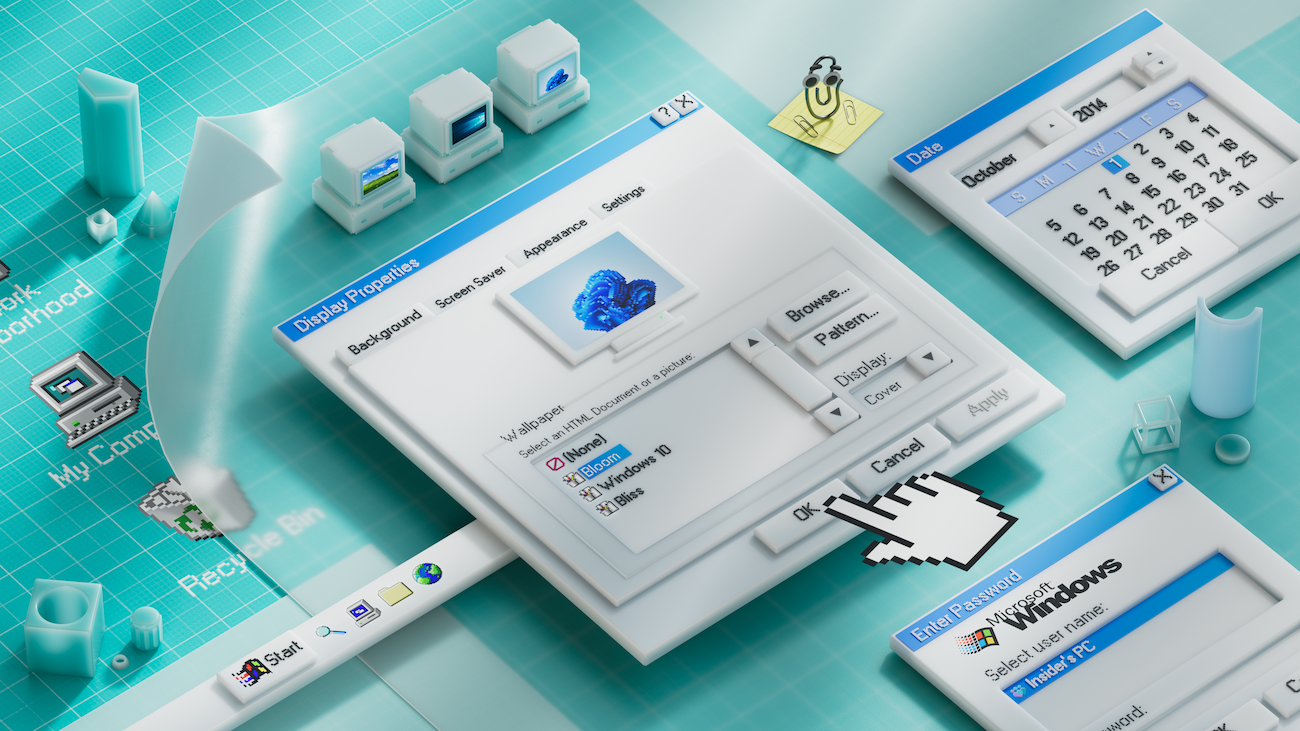
When Apple unveiled its most recent update for macOS, many people immediately thought of a renaissance of the Aqua UI from the early 2000s. Aqua was Apple’s glossy, colorful, and highly skeuomorphic design language, famous for its candy-like buttons, blue gradients, and translucent effects. With Tahoe, Apple seems to be bringing back that sense of […]